the wardrobe: A branding case study
The Wardrobe, formerly known as the Career Wardrobe, is a nonprofit that serves the greater Philadelphia community by providing well-maintained and stylish clothing that is perfect for everyday wear, from work to play!
In the Spring of 2020, my team was assigned to rebrand The Career Wardrobe as part of The Hatchery, a class taught by Bryan Satalino at the Tyler School of Art and Architecture in the Graphic and Interactive Design Department. Each of us researched the company and brand ethos in small groups but would create separate branding and logo designs. Each student would present the designs to the Career Wardrobe staff and owners at the end of the semester.
The Problem
The Career Wardrobe’s branding at the time lacked cohesion, a modern touch, and gender-neutral characteristics. The current (early 2020) identity was confusing, with numerous marks that needed unity in the style and design. The logos were busy and lack responsivity when scaled up and down. The color choices and style of the logos were outdated and needed a refresh. Additionally, the store was split between men’s and woman’s clothing, and the owners and employees wanted a more gender-neutral take that supported all gender identities.
The non-profit also wanted to shift from their unclear objectives as a brand — were they a boutique? a consignment shop? a work clothing store for people in need? They wanted to consolidate the brand’s mission to fit their future goals and make the shop a successful nonprofit for years to come.
Research
Through discussions and surveys with the Career Wardrobe staff, donors, and customers, I learned key information to form my rebrand around.
Although we suggested a shift from purple, the owners were very attached to the purple and wanted the color to remain in the brand in some form. The rest of the staff asserted that the current tones were outdated, so even if the colors remained similar, the shades should be adjusted to be more contempory.
Theose interviewed also found that logo mark was outdated with the gendered iconography as clothing itself is not tied to any gender. Donors, clients, and employees argued that removing gendered branding would be the best step moving forward.
Many people interviewed found that the branding at the time was too elaborate and overly detailed for the current usage. I also learned that due to budgeting, the logo would only be updated infrequently, so the designs needed to last years and still appear modern.
Previous Identity
the previous branding for the Career Wardrobe is overly gendered, busy, and lacks cohesion
Branding
With this information in mind, I came up with a plan to match the inclusive, professional, and approachable qualities that the clients wanted the nonprofit to represent.
I decided to simplify the logo and brand name, to remove the gendered characteristics and complicated and distracting imagery of the previous identity. I also wanted to update the color palette to modernize the brand, but keep the core purple, as the clients were adamant about keeping some semblance of the previous branding, but I would choose a purple and complementary color that could stand the test of time. The lockup of the logo could also be improved, as the current design is not as responsive to various environments.
New Brand Voice/Objectives
From discussions with the clients and further research, I decided to rename the Career Wardrobe to the wardrobe. I clarified the brand voice to match the expectations of the clients, following their direction, the wardrobe is now focused on providing confidence and respect through professionalism, encouragement, and enthusiasm.
The new identity would convey professionalism, feel current and up to date, but at the same time, the branding would be timeless and can remain relevant and modern over a long period of time. Additionally, the brand would feel welcoming and friendly, not intimidating, and would be eye-catching and unique.
Evolution of Logo
logo sketches
I worked on various logo renditions, focusing on existing iconography within the brand, gender-neutral collars, and other clothing marks. Continuing with the frequent use of buttons in the Career Wardrobe's branding, I attempted logos using stitches, buttons, and pinking shear marks, but after talking to the clients, I learned that they wanted to stay away from fabric-centered marks. I then worked on designing logos tied to collars, as they symbolized professionalism, yet could be worn by anyone. Some designs were too feminine and some were too masculine, so I needed something that was inclusive to any shopper.
Final Logo
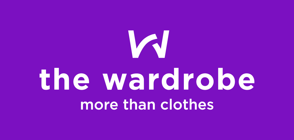
The final brand signature for the wardrobe is made up of a monogram style mark that abstracts the idea of a collar in the forms. The mark is timeless, clean, minimal, approachable, and modern which matches the brand's ethos.
I came up with responsive marks for alternative uses when the mark needed to be scaled down. For social media profile photos, the white "W" mark would sit inside the purple fill.
responsive logo marks
Typography and Color
I chose Gotham to convey the modern, timeless, and bold traits of the rebrand. The font-weight would depend on the use, purple type in bold for the header, light purple type in medium for the subheader, and dark purple type in book for the body copy. The typography would hopefully be simple and clean enough to last for years without looking outdated.
I decided to keep the purple and a shade similar to the green of the original branding to keep the branding recognizable. I adjust the purple shade by adding tints of blue and paired the color with a teal to modernize the color palette. Furthermore, I added additional shades of teal and purple so the branding could be utilized in a number of applications.
Alternative Color Lockups
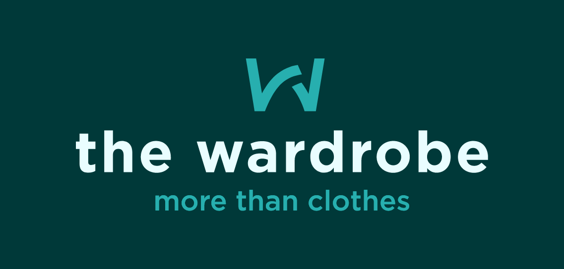
Additionally, I devised alternative lockups for the logos using a variety of color combinations from the color palette I created. The secondary colors would be a teal-based mark and a purple fill with white type.
secondary branding colors
Other branding colors alternated between dark fills with light type, or light fills with purple or teal type. I included black and white renditions for certain applications in which color printing was not available.
tertiary branding colors
Proper Usage
Full-color treatments would be placed on white backgrounds. On dark backgrounds, the logo would be knocked out in white. There are a few variations where white is replaced by the light teal color. In the final brand package and style guide, I include identity violations the non-profit should avoid.
identity violations
Additional Branded Elements
brand icons
Icons
The brand icons can be used in various applications. The icons are based around different symbols representative of clothing and shopping. The cut-outs match the style of the logo mark.
Image Treatment
Below, the image treatment is demonstrated to show how images would be edited to support the branding. To achieve the style, an image would be placed into Photoshop. The in-home designer would use a gradient map to create the effect.
image treatment
Final Design
After a semester of research, conceptual planning, and design we are finished with the brand identity of the new the Wardrobe!
Enjoy!
Art Director: Bryan Satalino
Deliverables: Branding, Logo Design


