tend: self-care for those who care for others
tend is a self-care app that reminds caretakers, volunteers, and organizers to take breaks and nourish their body while they tend to people in their community. Caretakers spend so much time helping others that sometimes they forget to check in on themselves. Wellness is incredibly important to keep energy and moods up so that the caretaker be at their best and help people enthusiastically. A sleepy volunteer or a hangry community organizer is never good.
The Problem
This summer I volunteered at the James Talib Dean encampment on the Benjamin Franklin Parkway known as “Camp JTD” for short (named after a resident who passed away from an overdose during the first week) nearly every day.
The experience was incredibly life-changing and rewarding, but I realized that other volunteers and I would push ourselves past the physical limits of our bodies and work long hours in the heat with little breaks or days off. The stress and exhaustion would build-up, and disagreements could get heated fast.
Similarly, I found myself in positions where I was organizing events with clubs and other groups and found myself forgetting to take days off. With all the stress of classes once school started again and other factors, I began to realize how much my body suffered when I did not take care of it. Other friends who were also organizers also got burnt out from overworking themselves and it was hard to see.
After examining all the issues surrounding volunteering and community organizing I decided that focusing on self-care was a good place to start. I realized that caretakers like parents of kids with autoimmune disorders, or spouses of people who had degenerative brain diseases would benefit from a solution to these problems as well.
I decided to design a hypothetical app that would remind users to take breaks for water, snacks, mental health checks, and days off.
Research
I spent many weeks researching competitor apps and users to determine the function of the app itself.
For qualitative research, I began to compile information from different sources. First, I began to notate what I personally had experienced myself and the pain points I felt while volunteering and organizing. I next started to jot down general observations from volunteering at the camp and then started writing down specific examples of my fellow volunteers and the frequency in which they took breaks for water, food, mood swings, or days off. I found that very few people took days off or breaks, and their mental and physical health suffered, especially in the summer heat.
notes I took from observations I made while volunteering
For both quantitative and qualitative data, I made a survey and sent it out to friends and family I knew who fit the app’s demographic to see their pain points and how they could benefit from my app. I also posted the site to numerous Reddit and Facebook in hopes of getting a wider reach. Through graphs and written responses, I decided to focus the app on four functions: water breaks, snack breaks, mood checks, and reminders to take days off.
conceptual mind mapping and data visualization of the responses from the survey I sent out
User Personas
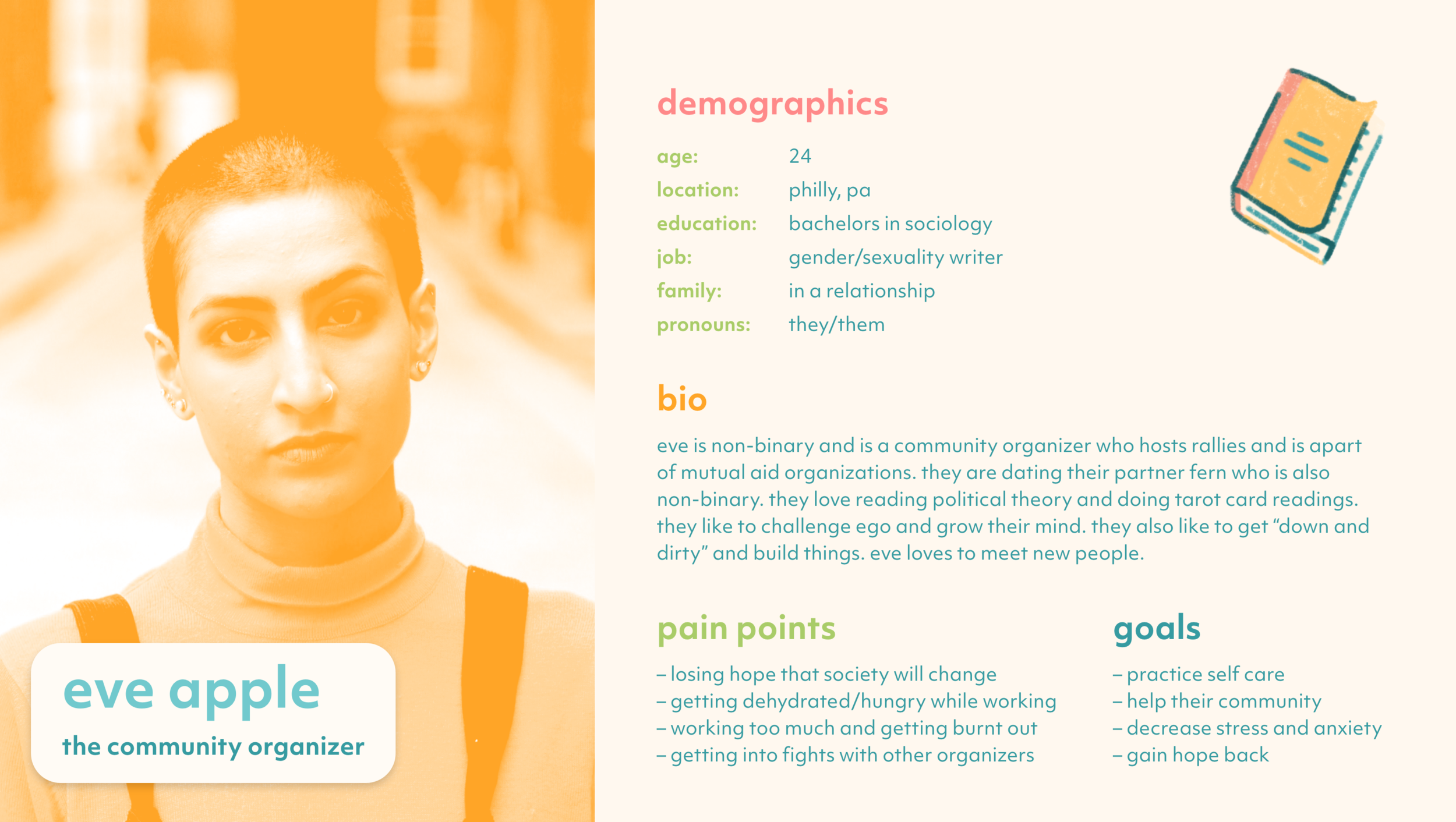
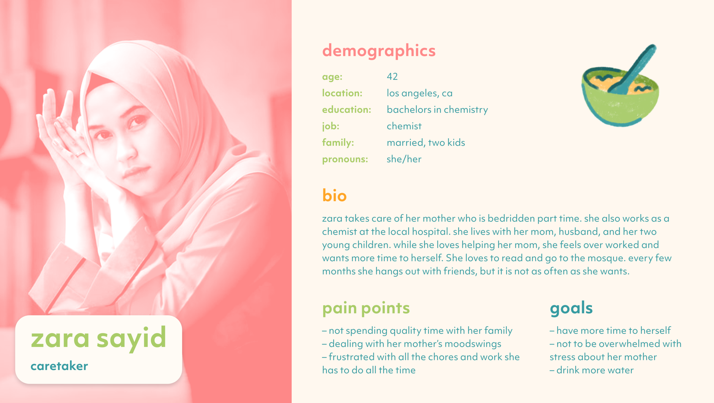
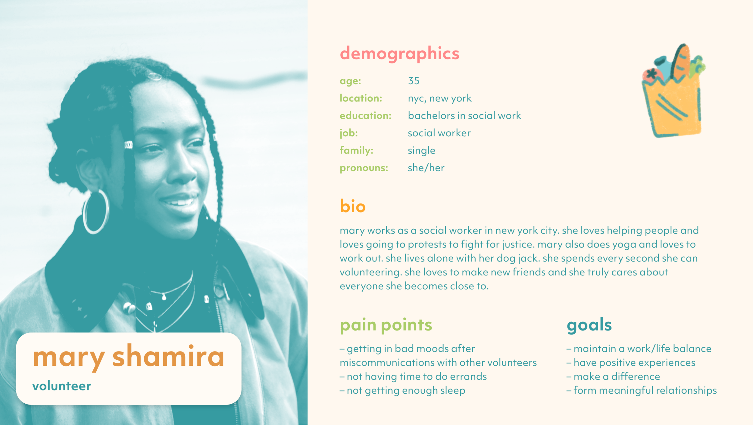
I wanted to narrow in on my demographic and create user personas who would help me create the user journeys for the user experience. I created three personas to emulate a variety of users who would try my app. I based these archetypes on my data findings and combinations of personality traits I had seen while volunteering and organizing in my clubs.
Three Types of Users:
Caretakers: Someone takes care of friends or relatives who are unable to take care of themselves due to medical (mental or physical) reasons.
Community Organizers: Someone who plans protests, mutual aid work, strikes, community events, and other actions that benefit the community.
Volunteers: Someone who takes part in community service.
All can work either full-time or part-time, but are not paid, I figured I wanted to focus on a specific group and not include the bigger demographic of paid caretakers like nurses and doctors.


user personas I based off of my research
Branding
Branding is a huge part of designing for a company because it shows how a product or brand wants to be perceived by its users.
a name word map and beginning logo sketches that began the branding
The name “tend” made the most sense for the app after brainstorming numerous word pairings and phrases on a mind map. “tend” was a short and sweet word that both represented tending to your body, but also caring for others. The name also hinted towards tending to a garden because plants could be an interesting visual mark I could add to my branding.
I spent a lot of time looking at competitor brand logos to see what worked and what didn’t with similar companies. The most popular marks for brands involving self-care, volunteering, caretaking, and wellness included hands, people, hearts, brains. For the color palette, colors that were soft and welcoming, but colorful, fun, and motivating to brighten someone’s day made the most sense.
logo research divided into categories related to caretaking and volunteering
competitor app research I used to see what features and style I wanted tend to have
tend’s final logo
Final Logo
After various sketches and revisions, the final logo was done, with two hands sat opposite each other, almost in an embrace, but in an arrangement and color palette that mimicked leaves. The logo feels warm, inviting, but motivating. I use lowercase letters throughout the brand to continue this familiar feeling.
For the responsive logos for the app icon and other smaller collateral, the logo mark would be visible at small sizes on its own, with the wordmark used in other more flexible cases.
Brand Attributes
Figuring out the brand attributes or the mood and atmosphere of the brand is important when figuring out what direction to head in for the style. I found that I wanted the brand to be motivating, reassuring, welcoming, approachable, calming, fun, with a focus on taking care of yourself.
Style
To match the brand attributes, I wanted the colors to be soothing yet playful with the designs to be visually simple and elegant, with clean typography, a soft drop shadow to add depth, and fun textured illustrations.
The app would have a calming cream background with somewhat subdued yet inviting pastels for typography and graphic elements. I designed icons and buttons to match the theme. In order to have the footer and footer icons stand out from the rest of the app, I chose to make the footer green with light icons with colored accents. The graphic shapes would have a rounded edge, and the stroke would be rounded to make the brand more welcoming.
For typography, something minimal and modern made sense from my research so I chose Objektiv for the body copy, subhead, and header. In order to keep a consistent interface, links would be in teal, body copy and subheaders would be in dark teal, and headers would be in green. Orange, pink, green, and the teals would be alternated occasionally on the journal pages. For the buttons, the background would be light teal.
The drop shadow adds a hint of depth to an otherwise flat interface. For photographic elements, I used a duotone overlay to homogenize the images, alternating the color to add interest. For illustrative elements, I used a soft, fuzzy brush to draw the images, I wanted to make them fun, playful, and eye-catching. A variety of colors is used to add excitement to the designs. A teal stroke was used to further the unique stylization. For various collateral pieces, I drew a few icons of trash bags, canned goods, and grocery bags to highlight the various activities someone may enjoy as a volunteer or caregiver.
a style tile condenses the branding elements into one visual spread for style reference
Brand Assets
Brand assets are important to show how a brand will be realized in the real world through collateral such as business cards, letterheads, packaging and so much more.
I decided to keep it simple and make business cards to show how the brand continues on paper. The cards are minimal yet fun with bright colors and simple type. I included mini illustrations of volunteering and caretaking activities so that the workers at tend could personalize their business cards with their favorite activities and could show their hobbies off when they passed the cards out.
business cards supplement the branding
I also decided to create an Instagram campaign since Instagram is integral to marketing, especially for a younger generation. The account would be used to continue the community and motivational atmosphere off the app and off the ground. To keep the designs visually pleasing, the posts would alternate between inspiring quotes, filtered images, and illustrations. The colors would alternate to create a dynamic composition. The images would be easily re-creatable in the brand style and handing off to marketing and social media teams. The quotes would focus on self-care, inspiration, and community.
the Instagram campaign that would work alongside tend
UX/UI
User experience and user interface design is an integral part of app design. Designers must thoroughly plan the app before prototyping to make sure that the user takes the easiest journey through the app and has a positive, memorable experience, and wants to use the app again. Planning and testing prototypes repeatedly will improve the app by making the experience better after each test. UX/UI design is a cyclical journey of testing an idea, trying the idea out, determining if the theory was successful, and going back to and coming up with new ideas until the user interface and experience is the best it can be. This system mirrors the scientific method in academic and clinical studies.
App Function
After my weeks of research, I found that users most wanted an app that could remind them to take water, snack, and mood breaks, and days off. From personal experience and testing competitive apps, I found that journaling organizing, caretaking, or volunteering “shift” would help the user notice various trends and adjust their behavior accordingly. Journaling also helps bring users into the present and let them express their feelings positively. A section for statistics would also help the user track their moods and behaviors even further.
User Flow and Card sorting
After deciding on the functions of the app, the designer needs to figure out the location these features will fall under in the app. I began to first jot down all aspects of the app I wanted to include and thought about the experience I wanted the user to have. I used my user personas to inform these choices. I wrote out a preliminary user flow to see what journey a specific user might take through tend. I also devised a beginning site map to see where each section in the app would go where. On the Miro site, I typed each feature into a digital sticky note and organized them based on my site map and user flow in the way that I thought was most logical. I then shared the miro link with classmates, family, and friends and to card sort thee sections in the way they thought fit best.
classmates and family members used miro to card sort features of the app into sections based on where they thought the information would fit best
After they were done, I analyzed what they chose, and began to redesign the sitemap and user flow from my findings. I moved features around until I decided on groupings that made the most logical sense and would make the app easy to use.
I synthesized their responses and devised a user flow
Wireframing
After the card sorting phase, the next step is wire framing. Wire framing helps the designer chose the best structural interface and steps for the user to take for the app. I began wire framing the journey and sketched each hypothetical screen.
I began to sketch the screens a specific user would take, the sketches can be somewhat messy, as the designer only needs to be able to grasp the basic components, function, and visual hierarchy of the app.
I found that splitting the app into three sections would suit the app functions and user journeys well. There would be an onboarding section to introduce the user to the app where the app would obtain the user’s preferences and information. Preferences would include how often they wanted water, snack, and mood breaks, inputting email and name information, and smartwatch and health app activation.
The second section would be where the user would “start a shift” and would get alerts based on their preferences from the first section. They would be reminded to drink water, take a snack break, and mood break. If the mood check found that their mood was low, they would have the option to checkout some mood resources, such as journaling, mindfulness, and reading positive affirmations.
The third section would be the journaling aspect, where they could input factors from their days such as the weather, certain activities they did, social experiences they had, and many more. They could jot down a journal entry about how the day went, and they could write about how the day could have been improved.
After they submit the entry, they can look at past entries and check statistics. If the user has a few bad days in a row, the app will ask them if they would like to take a day off to re-coop.
preliminary wireframes of my original user flow
Prototyping
After sketching the wireframes, I then started to move the sketches into Adobe XD for the low fidelity prototype. I used simple colors, fonts, and shapes to focus on the structure of the app and the user journey.
low fidelity xd screens
I continued to adjust the app prototype based on feedback from my classmates and professor. I found that it would be easier to visualize the onboarding questions and journal entries as multiple pages so that there wasn't too much information cluttering the page. I also found that the design would be more cohesive and understandable if I added drop shadowed sections to separate different features. I learned that the headers and buttons should be placed at a consistent location to maintain a reliable design.
I then slowly started to add color and style from my UX/UI kit and style guide and continued to receive feedback on the interface and user experience.
High Fidelity
Finally, I filled in the brand style on every page. I proceeded to work on the prototype and make small changes based on critiques in class.
high fidelity xd screens
Final App Design
Finally, we have the finished result! After months of research, planning, prototyping, and designing, we have a high fidelity prototype for tend!
final tend walkthrough
Art Director: Abby Guido
Deliverables: Branding, UX/UI, App Prototype


